Uncategorized

Arts/Crafts Projects

I have not been a total lazy bum lately.  Actually, my productivity will probably continue to go up, as Tim and I recently finished watching Lost on Netflix.  That a was a huge time-suck, but what else are you supposed to do in the dead of winter in the middle of the Midwest?

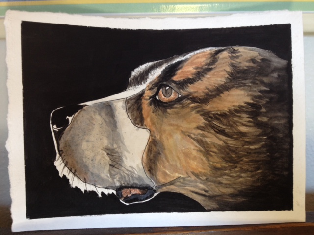
Anyway, I’ve worked on a couple of projects lately.  The first one I started a few weeks ago.  My brother took this amazing picture of his dog, Jojo, staring straight into the sun.  You could see the sun shining through his eyes.  So beautiful.  I tried to capture it with watercolor, but it didn’t quite pan out.  Here is take 1:

I like how light his eyes are and how the front of his face (the side facing the sun) is pretty bright.  However, I didn’t get the slope of his forehead right (Jojo is part Pit, part Boxer), and his juicy jowls were underdeveloped.  I also wanted to blacken the background some more with another coat of Lamp Light guache.

I think I just made it worse.  Here is take 2:

I ended up darkening the face too much and accidentally took the light out his eyes.  Oh well, live and learn, right?  I should try the whole painting over again, but that’s just so frustrating to me.  I have a zillion (almost literally) pictures of JJ to work from, so maybe I should just try one of those.

I’ve found, however, that I paint and draw things better that I am intimately familiar with.  When I am sketching or painting, I can almost feel the curve of the eye or the ear in my fingers if I’ve touched it enough in real life.  We are visiting Jojo (and my bros) this July, so maybe I’ll have to give Jojo a good, thorough head scratch, and then try my hand at painting him again.

In between takes 1 and 2, I worked on something much less frustrating.  Tim got me a Sony e-Reader, but I had no cover for it.  Tim suggested crocheting one. I decided to take him up on his suggestion and made this over the course of 2 Bones episodes:

It took 3 tries to get the coozie to be the exact right size (not too tight, not too loose), but the final effect is kinda pretty.  The coozie is unsealed at the top, so I cannot use it upside down (until I figure out how to make some sort of clasp, at least), but at least it keeps the Lucent hair off.  I just stitched a chain with a combo of Peruvian Print and Heather Grey and then did double crochets off that chain, working up until the coozie was tall enough to cover the e-Reader.  Not too shabby.  Maybe I’ll try selling these on my Etsy site. I haven’t sold one thing on it so far; maybe this is my meal ticket.

So that’s what I’ve been up to.  Mammacita and I are taking a Zentangle class on Saturday.  That promises to be fun!  I will post pix from the day afterward. I’m sure Mom’s stuff will be amazing 🙂

Uncategorized

It’s finally finished

Back in April, one of my co-workers found out that I dabble in calligraphy, and he asked me to do “Dance like nobody’s watching” in calligraphy on a small sheet of paper, so he could give it to his wife.  I assured him that I am no good as a calligrapher, but told him that I could probably convince my mom to do the piece, as she is an excellent scribe.

I never caught her in the right moment; however, so I resolved to do it myself.  I did 4 or 5 pieces that I was very dissatisfied with.  Then I decided to do it on watercolor paper on top of a nice watercolor wash.  I finally completed one that I was fairly happy with only to realize that I had written “Dance like nobody’s wathing.”  According to the Urban Dictionary, wathing is “Stalkerishly watching someone or something bathe.”  I think the most disturbing part of that definition is the part about watching “something” bathe in a stalkerish manner.  Shiver.

Anyway, missing the “C” changed the meaning of the phrase resolutely.  So I had to start over.  Again.

I was working on painting an ocean scene, so my palette was already loaded with purples, greens, and blues, so I got the paper soaking wet and washed those colors over it.  I then peppered the paper with kosher salt.  When it was all dry, it had a neat, almost tie-dyed, effect.  I drew guidelines on and went at it with a teal calligraphy pen.

Man, I really need to start taking better pictures of my stuff.  Anyway,  it’s not awesome, and the calligraphy  needs a lot of work, but I gave it to my friend yesterday, and he was really happy with it.  As long as the (non-paying) customer is happy, I am happy. It only took me 6 months to complete it!  Now I just need to finish my Mom (from Futurama) painting, and I’ll have a totally clean slate.

To get me off on the right foot, this morning I spent half-an-hour typing up an inventory of all our (“our” being Mom and me) watercolor paints.  It seems that for every class I take, I have to spend $40 on paints, even though I already have 3 baggies full of them.  Somehow I never have the exact right shade of cadmium yellow (the teacher requires deep and I have light, etc.).  To save time, I created a spreadsheet with columns for Main Color, Color Name, and Brand.  Now I can easily sort to see all the various reds or greens that I have.  It’s pretty awesome.  I kinda want to sign up for a class right this minute, so I can tell in 60 seconds whether I already have the appropriate colors in stock.  Ah, blessed spreadsheets…

On that note, Go Hawks!  Weeeuuwww!

Uncategorized

Watercolor Aspirations

So…again I haven’t written in a while.  That doesn’t mean that  I haven’t had anything to write about.  It just means that I haven’t written in a while.  I’ve actually had tons of things I wanted to write about, but my old bane, inaction, has been at it again. Maybe if we tossed the couch and the TV, I might actually get something done.  I blame some of my inaction on an uninspiring work location.

I moved my laptop to the top of our book-case in an attempt to create an ad-hoc stand-up desk.  It works fairly well; however, I don’t have much room to work, and since I’m just standing there facing the wall, I feel rather anti-social.  It’s not an environment that is conducive to creative enterprises.  It’s conducive to checking email and Facebook, and that is all.  My brother and father are both building me stand up desks…eventually. They both have plans, and they will both build something amazingly beautiful, but it may be awhile.  Anyway, once I get my stand-up desk(s), I am going to experiment with a little rearranging, so I can position it in front of a window instead of a wall.  I stare at fabric-covered walls for 8 hours * 5 days a week, and I can’t take the wall-staring a minute longer on the weekends.

I did find a way to alleviate some of my cubicle discomfort.  I purchased a piece of original, amazing art from Ryan Hayes.  It’s a small piece of art that packs a big punch.  It’s funny; when I first considered taking watercolor classes, I was reluctant to do so because when I thought of watercolor, I thought of poorly painted, washed-out, sad little flowers.  That wasn’t what I was interested in painting. At all.  However, the more watercolor work I see, the more  I realize how false my prejudice was.  People create absolutely stunning work with watercolor.  It’s ironic, though, that the piece I bought is a painting of flowers.  But it has amazing movement in it.  Check it out here.  See what  I mean?  Anyway, I hung this painting up in my cubicle.  It breaks up the expanse of grey & tan and provides my eye with a much-needed visual retreat.  It also reminds me that I should be doing artwork of my own.

On that note, I signed up for another art class at the Figge.  This class will focus more on technique, I think.  I kind of jumped into watercolor painting without have any basics in it.  Hopefully this class will strengthen the foundation.  While looking up the colors that I need for this class, I ran across this website:  http://www.watercolorpainting.com/index.htm.  It has tons of good information and tutorials on the basics (how to hold your brush, how to do a wash, etc.).

My friend, Butterbrickled, is creating an animation involving pirates and ninjas.  It looks great so far, and he has enlisted my help to paint some floaty/Tiny Wings inspired backgrounds for it.  I’m happy that he has assigned me a task, as hopefully it will make me actually get my gear out and get to work.  I lack motivation something fierce.

I read a good article from LifeHacker today, though.  The article advised just DOING something, one thing that you’ve been putting off, to get yourself out of a rut.  It’s so easy to fall into a rut of inactivity, and so hard to get out.  But just by taking action – any action (cleaning off your desk, for example), you can start to lever yourself out.  I have  about 10 things hanging over my head that I know I need to do, but I keep putting off. So, my baby step today is to finally write a blog post.

Uncategorized

My pretty letter S

I forgot to upload one of my letters last week.  This one is just a little guy.  I painted him on an ATC (artist trading card).  I tried to paint a border around the letter, but the line was very messy, so instead I colored in the background with a purple wash and then used my PITT artist pen to draw on the border.  I really like how it turned out.

I must say, though, that painting on 2.5″ by 3.5″ pieces of paper is tough.  I need to drink like 50 cups of chamomile tea to steady my hands first.

We’re taking a trip to Dick Blick in Galesburg today to pick up the supplies for our Mark Polomchak class next month.  I am super excited.  I am sure to buy more than I need, but I have a huge soft spot for art supplies – there is just so much potential there!

Uncategorized

Painted Mom and More Letters

I broke out the old watercolors again this weekend.  I need to finish up a couple of note cards for some friends, and my drawing of Mom (from Futurama fame) has been taunting me.  She’s all stretched out and stapled to my painting board, just waiting to be juiced up in living color.  Or at least in plastic color.

I’ll start with the letters.  Here is the M. I like the structure of the letter, but I wish I would have used a smaller palette of colors.  This is quite the rainbow M!


The N started out really well.  I was really happy with the balance of the letter, and the straightness of the lines.


I mucked up the painting of the letter, though.  The left-hand side got too muddied, and no amount of lifting the paint off would get it ethereal anymore.


As Tim pointed out to me yesterday, however (which amazingly came as sort of an epiphany to me), I have a tendency to focus on the negative.  I should focus on the right side of the letter, with which I am quite happy.  Half good is better than no good.

And…on to Mom.  I only have the base colors done so far.  She needs some more layers to get the colors right, and then some shading to finish her up.  I think she’ll look really cool when she’s done, though.


Look closely, and you will see that Mom’s hair is too big for the paper, and she has 2 staples through it.  I am spatially challenged, what can I say.  Maybe that can be my thing – my claim to artistic fame – all of my art runs off the page due to bad centering.  Ah, I’m waxing negative again, damn it!

Hopefully next week I can finish up the Mom painting and the cards, so I can figure out what to do next.  Mom (my mom, not the Futurama mom) and I are taking a watercolor paint class in Chicago (taught by Mark Polomchak) in February, so I need to practice some more, so I can keep up with the rest of the class.

Take care, and best wishes on your creative projects!

Uncategorized

Artistic Experimentation

As I mentioned in my last post (several weeks ago; I’m sorry to say), I worked on an art project a few weeks ago.  At the time, I couldn’t post pictures because the art was going to be gifts to my family.  But, Mom and Dad’s anniversary is over, and all the art was given to its intended recipients, so I can post pictures now.

As I’ve mentioned before, I dislike doing backgrounds when  I draw or paint.  I also enjoy doing calligraphy even though I am no good at it, due to a tremendous lack of practice.  Well, a couple of months ago I ran across Strathmore notecards made of watercolor paper.  I was intrigued and tempted by their small size.  I decided to marry my love of calligraphy with my dislike for large pieces of paper and made these:

With very light pencil lines, I drew centering lines vertically and horizontally.  I then used the Speedball Textbook to find a type of font that I liked.  I settled on blackletter, a beautiful gothic font.  Since, as I previously mentioned, I never practice calligraphy as I should, I cannot reliably free-form the letters.  Instead I sketched them out,  trying to get the angles and shapes correct.  It was difficult to see if the shape was perfect until the lines were filled in, however.  As a result, some of the angles are off.  There is something a little wrong with the bottom of this B, but I can’t quite figure it out…

Once I was fairly satisfied with the penciled-in letters, I went over my pencil lines with a Pilot Parallel pen (quick aside here  – I love this pen.  I hadn’t used it in months and months, but I just ran some warm water over the nib, and the ink starting flowing freely immediately.  It’s super easy to use).  As you can see in some of the more up-close photos, the ink did not lay on the paper completely evenly.  This is mostly due to the grain of the watercolor paper – it’s not the best medium for a calligraphy pen.  I think I should have used an Artist Pen, like the Faber-Castell Pitt Artist Pen, something that is waterproof and super black.    I also had issues with the ink from the parallel pen bleeding into the watercolor.  I kind of like how it looks, though – a little scratchy, a little messy.  I didn’t want the letters to look as if they were created on a computer.

Once the letters were drawn on with the pen, I started filling them in with watercolor.  My mom lent me several tubes of beautiful watercolor paint, but I resorted to using my cheap little Prang set.  My workspace is very truncated, and the Prang set is so nice and compact.  I mixed colors together that I thought were pretty and interesting, just to see how they would look.  In short, I experimented.

Blue fading to green for Nathan:

Red fading to yellow for Timmy Tee:

Inspired by the Celticness of the C for Charles, my Dad, I did green fading into orange.

To match my Mom’s gorgeous blue eyes, I did blue fading to yellow for Donita.  This is actually Take 2 for Mom’s card.  The first D I did for her was done using Uncial, a more rounded script.  I had a hard time getting the balance of the letter correct, and the color was not quite right.  When I tried to fix it, it just turned to mud.  So, I started over, and the second one turned out much better.

It’s hard to tell in the photos, but on each letter, I threw salt on the paint when it was still wet.  The salt absorbs some of the paint and gives it a slightly mottled look.  I just had to be careful to wait until the paint was completely dry before scratching off the salt; otherwise, smear city.

Once the letters were done, the cards looked a little too empty, so using a ruler I painted a border on each card, using the major color of the letter.

I wasn’t sure what to actually write inside the cards once they were finished.  “Happy Anniversary, Love Heather” just seemed too generic.  Tim gave me the idea to write a haiku in each card.  I haven’t written anything remotely poetic in probably a decade, but it sounded like fun.  I wrote 3 haikus for each person, and Tim picked out the one to put in the card.  They were nothing very earth-shattering or very clever, but I enjoyed writing them, and at least they will never receive a card from someone else with the exact same verbiage on it.

I want to make some more cards, so yesterday Tim and I took the 15 minute trip to Evergreen Art Works to get some more cards.  Unfortunately, they were plumb out.  They had every other single kind of card; just not watercolor cards.  Argh.  However, I kept looking around, hoping to find some cards forgotten on an end-cap somewhere, and found something else super cool – Artist Trading Cards.  They are these tiny (2.5″ x 3.5″) pieces of paper on which people create a piece of art.  The art is then supposed to be traded with other artists at some sort of art swap meet.  It’s amazing how creative people can be on such a little piece of paper.  Check out these images.

I can’t find any swaps in our area, so maybe we’ll have to start one.  I’m trying to talk Tim into doing some.  He is a super creative artist, and could make some really trippy ATCs.

Well, if I keep writing, I’ll never get to the cards, so I best sign off.  Happy arting everyone!

Uncategorized

Consumer -> Producer

Timmsy Tee and I did a little shopping today.  In the paper a couple of weeks ago, I noticed that the Waste Commission of Scott County, in conjunction with the Rock Island County Waste Management Agency, was hosting a Compost Bin and Rain Barrel Sale today.  Tim and I have long flirted with the idea of getting a compost bin, but they are wicked expensive (usually at least $100).  The Waste Commission was selling the compost bins for $40, so we headed down to the sale this morning.  It was a beautiful, sunny, warm, breezy day, and the line reflected the pretty day and all the pseudo-hippies’ desire for a good deal.  We waited in line for 30 – 45 minutes, listening to the incessant chatter of the day-care mom next to us, and the occasional wise words from the straw-hatted back-yard prairie planter in line in front of her.  It was an interesting 45 minutes.  It was actually really encouraging to see so many people who were willing to wait in line for an environmental tool.

The bin barely fit in our car, but we were able to squeeze it in.  We have all the pieces put together, but we haven’t screwed it into the ground yet.  I’m looking forward to no longer feeling guilty whilst throwing away coffee grounds, tea bags, and vegetable peels.  Hopefully within several months, we’ll have some nice, healthy compost to mix in with our clay yard.

After getting the bin situated, Tim went to the gym, and I went for a jog – the first jog in at least 2 weeks.  I ran a mile without stopping, and then walked about a mile, just enjoying the sound of the creek and the locusts and the wind in the late summer, crispy leaves.

For lunch, we headed out to Bent River.  We spent an hour or so lounging in the back patio, eating 99 cent tacos, fries with jalapeno ketchup, and drinking the Bent River Pale Ale – delicious.

Inspired by the free spirit pervading Bent River, at our next stop, Evergreen Art Works, I bought a few things I’ve been wanting for watercolor painting – a paint mixing tray, note cards made of 140 lb watercolor paper, and a 24″ x 32″ “Incredible Art Board.”  The teacher at the last Figge class had one of these boards.  You can stretch and staple watercolor paper to it, and it won’t bend or warp.  She had also taped wax paper to one side of the board, so she could mix her paint right next to her painting.  You can also flip over the board, and use the other side (of course, before flipping it, you’ll want to make sure your paint won’t run).  It was kind of pricey (around $33), but I think I’ll really like it.  No matter what kind of tape I use, I cannot get my paper to lie flat after I wet it.  The paint settles in the valleys and frustrates me.

I’m really looking forward to working with the watercolor cards too.  As I’ve mentioned in previous posts, I hate and am no good at painting backgrounds.  The smaller the piece of paper, the less background!  I’m getting several pictures printed at Walgreens, so that I have a variety of subjects to choose from – everything from flowers (might as well give it another shot) to bridges (architectural, straight lines are much more predictable than petals).  Here are a few samples of what I’m planning on trying next:

I'll just paint the Luce - not the background.

So, with all this consuming we’ve been doing today, we better start producing – producing compost and artwork.  Good thing tomorrow is Sunday.

Uncategorized

Watercolor Class #2

I took my second watercolor class on Saturday. It was again offered by the Figge, but this class was held at the Stone Building at VanderVeer park.  We met in the hot, old building for about an hour while the teacher (a former art teacher at Pleasant Valley) demonstrated various techniques (how to use salt, Frisket, saran wrap, etc.) to produce different effects.  Then she walked us through her hand-outs, which contained several tips on color combinations and composition.  Many of the tips came from “Painting Flowers in Watercolor” by Karen Simmons, a book the teacher highly recommends.  After the introduction, we gathered up our gear, braved crossing Central Park, and settled in for some plein air painting.

The class instructions did not tell us we would be painting outside, so I wasn’t very prepared, meaning I didn’t slather myself with sunscreen.  I tried to pick a shady spot, but the damn sun moved, and I ended up getting pretty burned on my shoulders.  Despite the sun, though, the first hour/hour and half working out there was super relaxing.  The flowers I really wanted to try painting (nice, symmetrical, small orange daisies) were in the full sun, so I settled on some slightly more complicated flowers (from the Gerbera family, I think?).  They were a almost flourescent shade of fucshia, especially around the edges.

I settled in on the detailed work, painting the inner parts of the flower in tiny detail, outlining the leaves and pulling the color down the petals.  I used the end of a paint brush to “bruise” the paper where the vein ran down the petal.  The effect was very subtle, but interesting. I can’t find any good light this morning, so I apologize for the shadows on the pictures.

While working on the flowers, the time flew by.  The teacher came over periodically and gave me some tips on color (needed to add more purple to get the color truer).  Some park visitors wandered by and said the painting looked good, which made me happy.

Then, I had to start on the background.

I HATE doing backgrounds.

Backgrounds suck and ruin all of my artwork.

I need to start blowing up my subject matter, so that it takes up all of the paper space.

I was fairly happy with the flowers; at least, I enjoyed working on them.  But, once I started on the leaves, I quickly got frustrated.  First, I used the wrong color and made the leaves too dark and dead.  Then I was at a loss about how to fill in all the white space, so I just started adding random leaves in everywhere.  And, I added a nice, washed-out sky.

So, the painting is definitely not hang-up worthy.  But, it was a good learning experience.  I learned that painting outside sucks. You get sunburned, you can’t easily get fresh water, your subject material has the gall to move with the wind, your eye can’t capture the changing colors as the sun passes over, etc.  I am definitely more of a paint by photo kind of gal.

The five other students in the class produced some nice work.  One especially chatty student (a retired woman who just recently started painting), painted a very Salvador Dali-ish canna leaf.  It was swirly and crazy and super cool.  Maybe that’s the key to producing something beautiful – you need to “interpret” it and not try to make a carbon copy of it.

It was a good class, and I’m glad I took it.  I don’t see myself doing a lot of paintings of flowers/plants (I enjoy painting houses much more), but  it’s nice to spend 3 hours with a random group of people who are content to sit outside and try to create a thing of beauty while getting to know each other.

Books, Movies, Uncategorized

A case of the Sundays

It’s been another lovely weekend in the Longoria household.  Not that it hasn’t been without its faults.  I re-potted two plants yesterday morning (and froze my fingers off during the process – literally.  Just kidding.  Not literally.  I figuratively froze off my fingers) but not before I dropped them three times.  One plant, the rubber tree, was actually dropped by Mother Nature.  A freakish and evil gust of wind blew the plant off our patio table, and the plant crashed to the ground.  The pot was a complete loss, but the plant seems to be okay.  The next plant I repotted was our beautiful jade.  The leaves seem to be falling off quite easily, so I postulated that the plant needed more breathing room.  As I shook the plant out of the existing pot, I noticed that the 14-inch tall plant was completely root-bound in its original clump of soil.  The circumference of this base was maybe 3 inches.  I broke up the root ball a little bit and then repotted it.  As I was taking it in the house, the top-heavy jade flipped right over and sprayed soil everywhere in our kitchen entry-way.  I clean it up, repotted the plant, and then cleaned the outside of the pot, which was completely covered in soil.  I walked 5 steps into the living room and promptly dropped the whole pot.  Dirt sprayed everywhere.  I was still looking at it mournfully when Tim returned from the grocery store and helped me clean it up.  Hopefully the jade will survive.  It lost many, many leaves.  It looks…curly, somehow.  I don’t think it’s supposed to look curly.  I hope it perks up.

That was pretty much the end of the tragedies for the weekend.  Although today when I was jogging, I did get glanced by bird poop.  It hit my sunglasses and the edge of my shirt.  It could have been much, much worse.

The good stuff that happened this weekend consisted of me making super delicious chocolate chip cookies, Lucent’s ear infection improving dramatically (thanks to Tim religiously cleaning his ear and putting meds in it daily), me purse-shopping and not buying anything, getting a tremendous deal on A Brief History of  Time and The Universe in a Nutshell book duo at Borders, finding nice folks at BWW who shared their table with us and relieved us from a 40 minute wait, and watching Shaun of the Dead.

Timmy Tee is ill, though.  He has a super bad chest cold.  I need to start sending him to work with a face-mask and rubber gloves.

I watched 500 Days of Summer on Friday night.  Gotta say, I’m not a fan.  Joseph Gordon-Levitt was good in it, but I found Zooey Deschanel to be affected and unrealistic.  They made her out to be some sort of guy fantasy.  I guess any girl with huge, blue eyes and a penchant for The Smiths is irresistable.  Maybe I’m just too used to seeing her sister on Bones.  Maybe one can only like one Deschanel at a time.  It’s interesting too, how being an architect is so often held up as being this laudable achievement.  I enjoyed architectural drafting as much as the next person, but I have to imagine that being an architect in real life is all sorts of tedious.  Drawing beautiful buildings would be awesome, but having to know thousands of building codes would not be awesome.  What’s wrong with being a greeting-card writer?!

I also finished I Capture the Castle by Dodie Smith (author of 101 Dalmatians).  I really enjoyed it up until the point that Cassandra (the 17-year-old girl who is constantly referred to as a “child” – is a 17-year-old really a “child?”!) falls in love with her sister’s fiance based on a single kiss.  Suddenly she is completely devoted to him.  It didn’t seem like realistic behavior for a girl her age, especially a girl who is continuously presented as being wiser than her years and more mature and insightful than her 21-year-old sister.  I liked the movie more, I think because you don’t get to know Cassandra as well in the movie, so her behaviour is less nonsensical.

I also attempted to do some watercolor painting.  I discovered that any talent I may have had has completely deserted me.  This is all I have to show for my attempts:

I decided to give color a rest and pick up my old standby, sketching.  I used a 2H pencil to sketch out Lucent, and then darkened it up with a nice charcoal pencil.

I think I need to find a good house to paint – maybe then I will find my mojo again.  If you have a good house photograph – one with interesting light and shadows (and uncomplicated detailing), please send it my way.  Maybe if I am beholden to an outside entity to do another painting and to do it semi-well, I’ll actually stand a chance.

Uncategorized

I thought producing art was supposed to be relaxing…

Prior to this weekend, I hadn’t painted anything since I finished the sky/cornfield scene.  I was on vacation, then I took off a weekend, etc. etc.  I figured I should get back on the wagon before I forgot everything I recently learned (I’m getting my tenses confused here a little bit, please forgive me).  Well, I think it’s too late.  Or, maybe it’s not too late, I’m just too impatient.  I want to be awesome NOW.  I realize I’ve only painted 2 watercolors in my life, but I still want every painting I attempt to turn out fantastic.  But it’s not. or they’re not.  or whatever.

This was the first one I did this weekend:

It is based on another amazing Benny Hageman photograph.  At first glance, I thought this would be fairly easy to paint – it’s sky, corn, field.  But, cornfields have an amazing variation in color, but the variation is on a tiny scale.  I could get all the colors in there (orange, brown, yellow, purple), but not at the appropriate scale.  I tried flicking the brush to get tiny dots of color, but I ending up flicking orange into the sky.  And the sky, eff it, would not turn out the way I wanted!!!!  The colors would not flow together.  Argh.

So, I gave this one a rest and started on another I thought would be fairly simple – an orange & lavender sky with dark corn stalks in the foreground.  (Based on another Benny Boo photo).  Once I finished this one, I actually threw it away.  But, I pulled it back out of the garbage.  This is all about learning and getting better, right?  Maybe by keeping this one around, I can look at it and remember where I went wrong:

Primarily what went wrong was this – I got too impatient and just starting slapping colors on.  I did the sky first, and the colors didn’t flow together well at all.  And, I couldn’t get peach.  This sky is lavender and peach, and the peach was very elusive.  It was teasing me and mocking me and being very annoying.  I was also using “illustration board,” not watercolor paper.  It doesn’t take the paint as well as watercolor paper. Also, you need to tape off the edges because if the edges get wet, water gets between the layers and ruins the painting. When I removed the tape, I ripped a corner of the picture.

Before I put all my supplies away (or sold them on Ebay), I decided to do a little practice picture of Lucent.  Mom gave me a really nice set of Van Gogh watercolors (I had been using the basic 8 color Prang set that they have you buy for elementary school), so I pulled those out.  I wish I would have tried them sooner.  The very first color I tried was the perfect peach I needed for the sky.  Again, argh.

Anyway, I experimented with the colors and ended up with this:

I’m frustrated that nothing turned out the way it did in my head or in the pictures.  But at least I got some practice in, and I didn’t end up just watching 8 episodes of Bones this weekend!  I learned that I need to slow down and really focus in order to produce something of which I am really proud.

I need to start working on another house painting.  Today is nice and sunny, so maybe Tim and I can take a photography journey through Dport and see what inspiration we can find.